Probably the hardest thing about routinely writing on the subject of the local real estate market is that it really doesn’t change overnight – thankfully – despite erroneous comparisons to the stock market. Short term trends in real estate are relatively predictable – largely because supply is not highly volatile. By contrast, demand has the potential to be far more volatile – anyone remember Desert Storm? Demand went to zero overnight and then returned in two weeks once it was clear this was really not a war but a “military action”. Despite the dearth of provocative headlines, it is still worthwhile to take a look at the market now that we have reached the half-way mark. Especially since market activity seasonally peaks in May, and gradually declines as we approach the end of the year.
Supply
So where do we stand on supply? The short answer is supply is very low, although not all areas and price points are affected equally. Even though supply is the more stable of the two market factors, in May it made a rapid shift in the under 200K range. As Tina Tamboer of the Cromford Report notes:
“Supply under $200K has continued to drop rapidly, but the $175K-$200K range has accelerated its decline over the past month far more dramatically than any other price range. After being consistently 30-35% below last year, the active supply level dropped a whopping 18% in a 3-week period putting the current count for this group 44% below last year.”
Gulp. That is one heck of a supply shift. Looking at Greater Phoenix, overall inventory is running at about half of what would be considered normal. Not surprisingly, the lowest priced areas have the weakest supply – with only a few exceptions. The Cromford Report did an interesting study of the most constricted supply mid- May:
“Here are the 10 ZIP codes with the lowest days of inventory as of May 16:
Phoenix 85035 – 17
El Mirage 85335 – 18
Mesa 85202 – 21
Phoenix 85033 – 22
Mesa 85203 – 23
Gilbert 85296 – 24
Youngtown 85363 – 24
Phoenix 85037 – 24
Phoenix 85009 – 25
Mesa 85210 – 25
25 is an extremely low reading for days of inventory. All of the above are in West Phoenix, West Mesa or the El Mirage / Youngtown area, with the exception of 85296, which is rather more expensive”…..
“For supply, it is the range below $500,000 that was most affected with months of supply down from 2.1 to just 1.5 and a 31% drop in active listings. The range between $500,000 and $1 million was down 16% in active listings pushing our months of supply lower from 5.7 to 4.1. Over $1 million there was a drop in supply, but only by 5%. There is currently just under a year of supply over $1 million.”
Although a year’s supply over the million dollar mark may sound hugely excessive (especially through the lens of the under 500K price range) we well remember years where that price point had 7 years of inventory! So this price point has shifted dramatically. But as mentioned in the zip code study above, not all areas are experiencing the same shortage of supply. Anthem for example, in December was experiencing a lack of supply and seller’s held the power – only to see now, 6 months later, a fully balanced market.
Demand
Demand is up 7% overall from last year – but just like supply – different price ranges have been affected disproportionately. Surprisingly the largest jump in demand came from the high end of the market (homes over $1 million). Sales in that range jumped 32% – juxtapose that to the under 500K market which saw a 5% drop in the quarterly sales due simply to inadequate supply to fill demand. When supply is low enough to constrict sales, it is very hard to see subtle shifts in demand. If the number of buyers standing in line for a home drops from 10 to 3, how does one staticize that? The Cromford Report religiously tracks supply and demand – and noted in April that a slight weakening of demand surfaced:
“Of course, with supply remaining very low, it is difficult to detect weaker demand in the real world. Only a careful day by day study of the numbers reveal the weakening trend. The trend has not lasted long so far, but if it continues for a few months then it could become more significant. It could then show up as fewer homes under contract and lower closings. We are not sounding an alarm here, just keeping a close watch on data signals …”
Price
As long as demand exceeds supply, prices will continue to rise. This inevitably results in alarmists saying we are in a “bubble” once again. The best answer to fear is facts. Take a look at the monthly average price per square foot compiled by the Cromford Report.
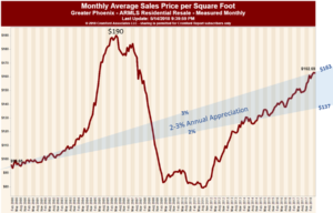
You will note that if you eliminate the wild swings both up and down, we are in a reasonable appreciation range – and the trend line looks nothing like the parabolic curve of the 2005 market.
At some point – rising prices (and possibly rising interest rates) will dampen demand, as it is supposed to do. Reduced demand will allow supply to climb and then the market will balance. Does that mean prices will then drop? No, balanced markets tend to see price rises within the range of inflation. The inflation rate for 2017 was 2.1% and 2018 is averaging 2.5% Remember too; price is a trailing indicator – often lagging 3- 6 months behind the market. For those readers who are understandably jittery given the pricing plummet of 2008, take heart. While we do anticipate a balanced market on the horizon – that could be a year or two out and it will take more than a balanced market to see marked price changes.
In the meantime, we will watch the trends and keep you informed. Slow moving ships are easy to watch.
Russell & Wendy (mostly Wendy)